Logo and brand identity · Premium flower e-shop
A logo that opens like a rose
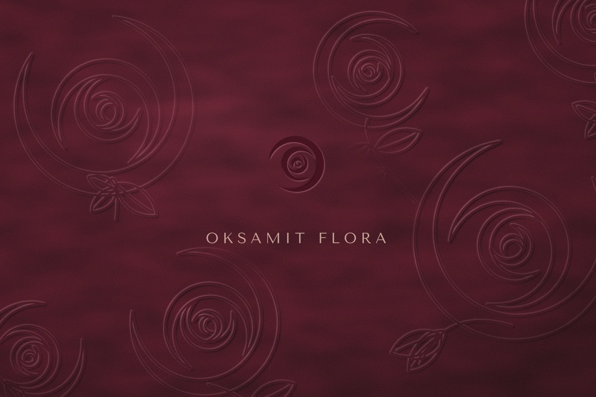
Logo and visual identity for Oksamit Flora, a premium online shop for cut flowers, mostly roses, shipped straight from Holland. The brand had to feel exclusive and timeless. Work on the e-shop is now under way.
The challenge
Online, all flowers look the same
The brand had to communicate price, quality and origin without shouting about any of them.
Standing out
The logo could not look like just another online flower shop.
Trust from a distance
Customers never see the bouquet before it arrives. Freshness has to be proven, not promised.
Timeless
The brand should last ten years without a redesign, so no trendy effects.
Holland without clichés
Origin without tulips, windmills or clogs.
An unfamiliar name
“Oksamit” (Ukrainian for velvet) had to become an advantage, not a barrier.
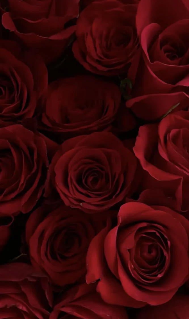
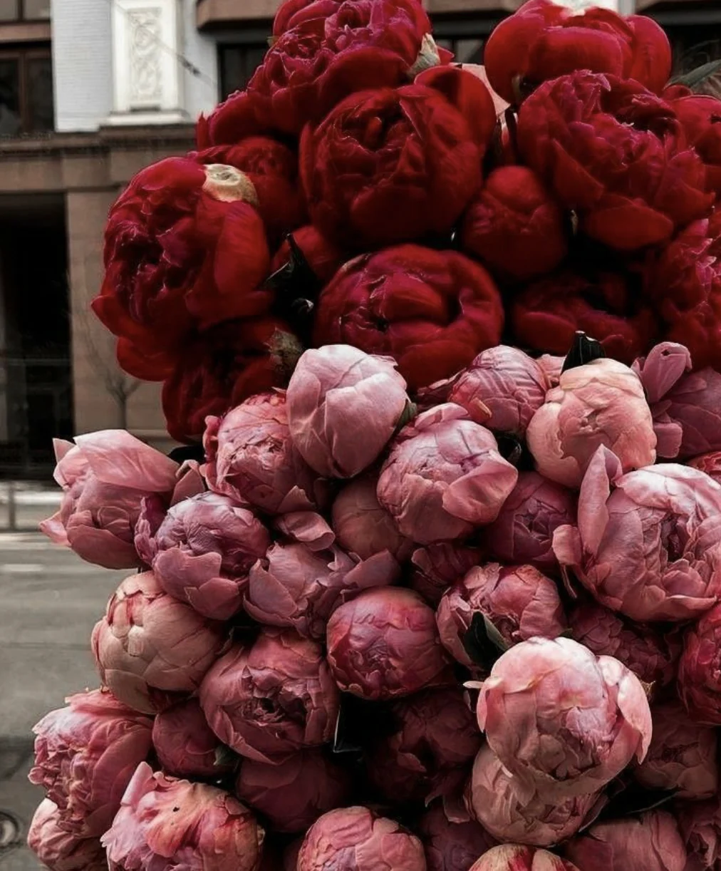
The mood started with the flowers themselves: deep reds, soft daylight and petals you want to touch.
Research
Everyone sells luxury. Few prove it.
I compared three groups of competitors. Each had a weakness that Oksamit Flora could turn into a strength.
| Category | Typical look | Our opening |
|---|---|---|
| Mass market | Bright pink, script fonts, discounts | Feels cheap, no story of origin |
| Boutique florists | Instagram aesthetic, handwritten type | Inconsistent, depends on the photos |
| International luxury brands | Black and gold, monogram | Cold, impersonal, no emotion |
Brand strategy
A botanical atelier with the calm of luxury craft
Oksamit Flora delivers Dutch roses at their purest. Four principles guide every decision, from the logo to the delivery box.
Freshness as proof
Every bouquet carries its variety, origin and date.
Quiet, not loud
No discounts, no exclamation marks. Space and air instead.
Craft
Every bouquet is a small work of botanical art.
Touch
A brand you can almost feel, even on a screen.
| We are | We are not |
|---|---|
| Calm and confident | Superior and cold |
| Poetic, but specific | Overly sweet |
| Personal | Over-familiar |
| A typical flower shop says | Oksamit Flora says |
|---|---|
| “Red Naomi roses, cut on Tuesday morning in Aalsmeer. With you on Thursday.” |
Oksamit is Ukrainian for velvet: like a rose petal you touch for the first time. The unfamiliar word became the brand’s conversation starter.
Sketches
Looking for the shape on paper
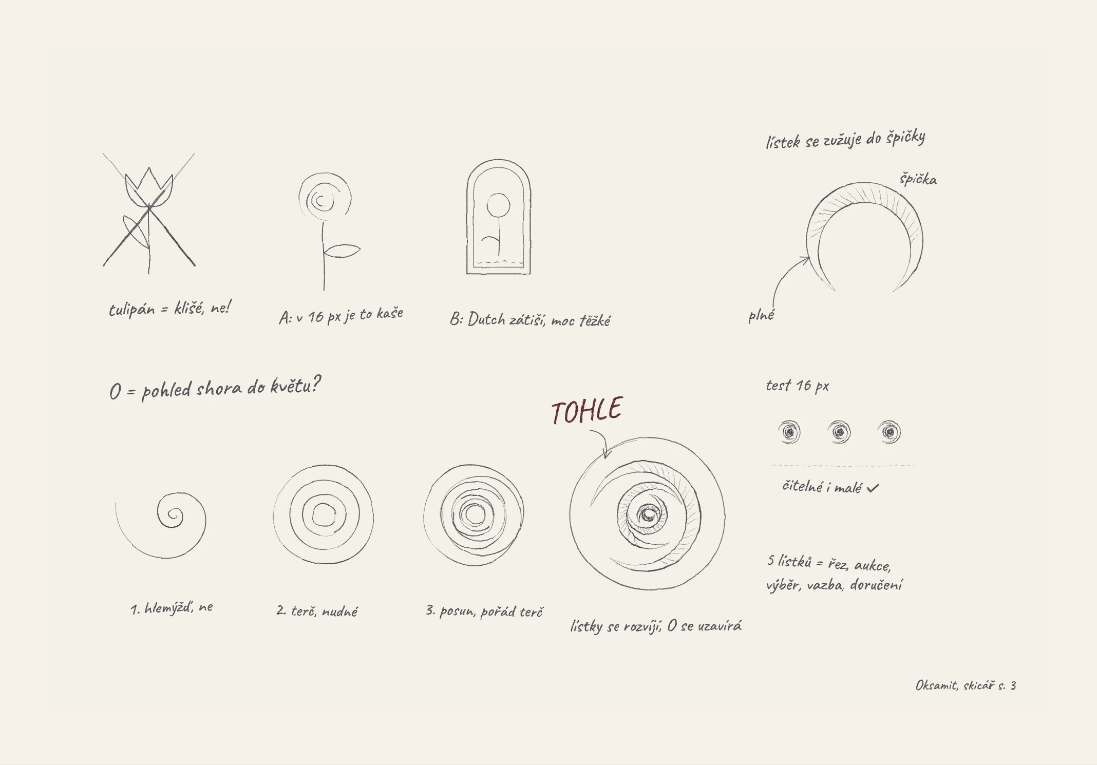
A tulip was the first idea, and the first to go: a cliché. A full rose turned to mush at 16 pixels. A Dutch still life in a frame told a good story but felt too heavy.
Then a question: what if the O is a flower, seen from above? The first spiral looked like a snail, the next like a target, and a shifted one was still a target. The answer came when the petals started to unfold and the O closed around them. Even at 16 pixels, it stayed legible.
The five petals stand for the five steps every rose goes through: cutting, auction, selection, arranging and delivery.
Concepts
Three directions, one choice
A
Botanical Line
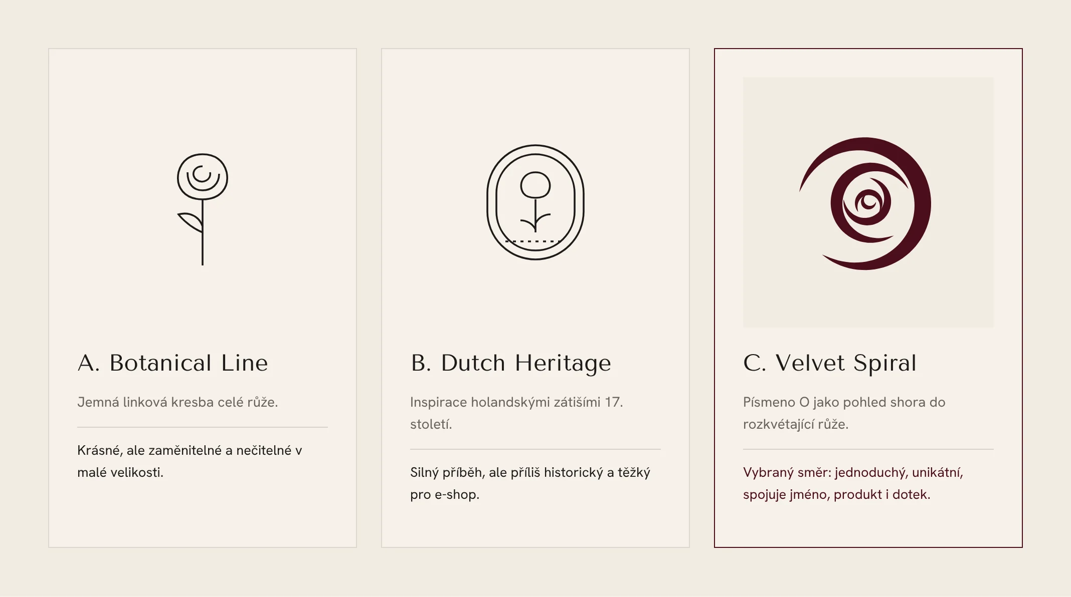
A delicate line drawing of a whole rose. Beautiful, but generic and hard to read at small sizes.
B
Dutch Heritage
Inspired by 17th-century Dutch still lifes. A strong story, but too historical and heavy for an e-shop.
C · chosen
Velvet Spiral
The letter O as a view down into an opening rose. Simple and unique, and it ties together the name, the product and the sense of touch.
Construction
Built on proportion, drawn by hand
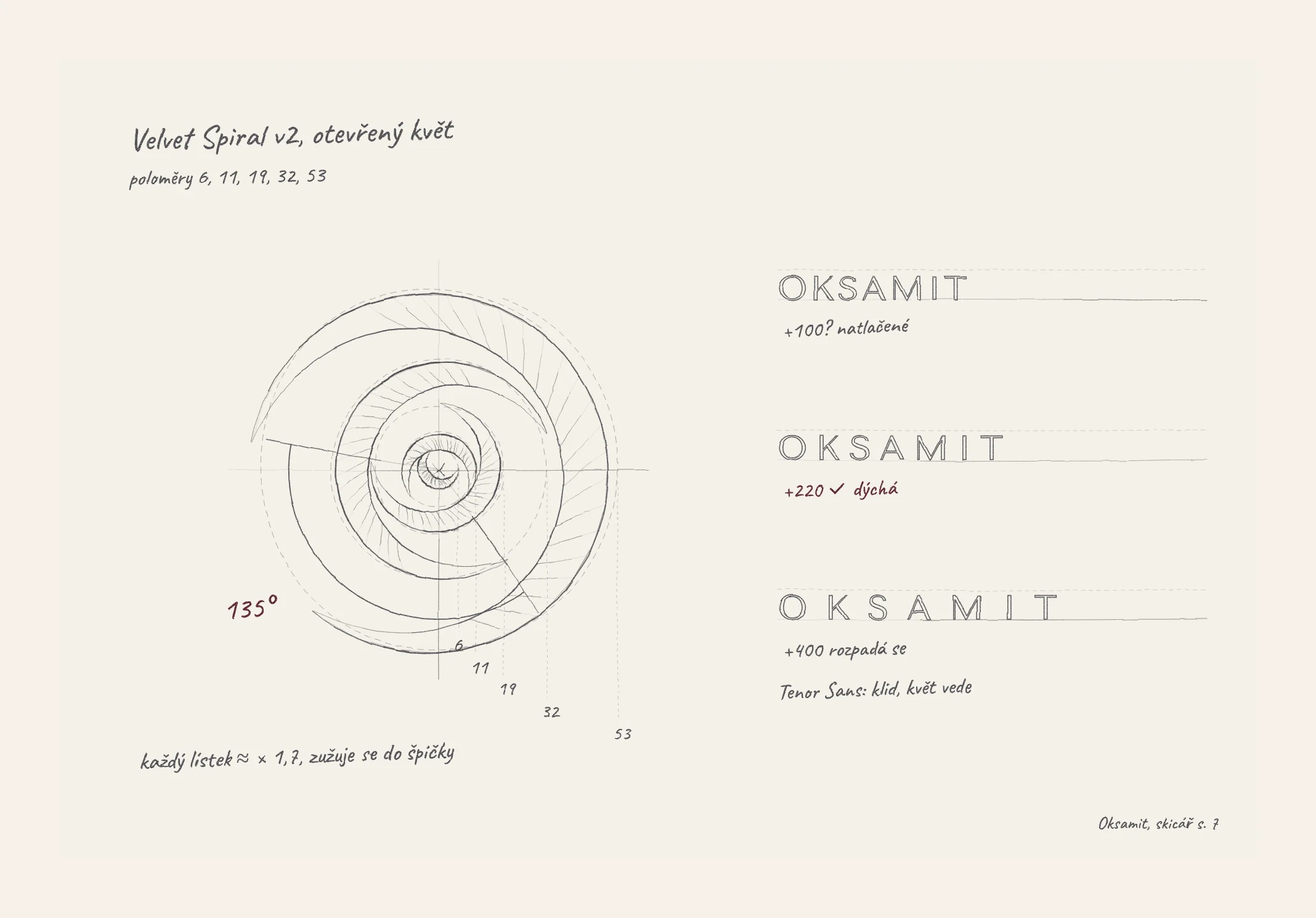
In the final version the bloom is open. Its five petals have radii of 6, 11, 19, 32 and 53, so each one is about 1.7 times the size of the one before, and each tapers to a fine point. The spiral opens at 135°.
For the name I chose Tenor Sans and tested the letter spacing: +100 felt cramped, +400 fell apart, +220 breathed. The type stays calm and lets the flower lead.
Visual identity
Deep velvet, airy cream
I deliberately left out the classic “flower” pink. It is exactly what makes the competition look interchangeable.
#F6F1EABackground and space#4A0E1CThe main colour#1C1A19Text#7D8B74Stems and leaves#B08D57Foil stamping onlyAcross the brand: 60% Ivory, 25% Bordeaux, 10% Ink, 5% Sage and Brass. Brass never goes above 5%.
Tenor Sans
The logo and headings
Hanken Grotesk
Body text and the e-shop interface
Brand touchpoints
The unboxing is the ritual
The brand’s strongest moment is opening the box. I designed it as a ritual in four layers.
Layer 1
The box
Matt Velvet Bordeaux, with the signet foil-stamped in brass.
Layer 2
Tissue paper
Cream, with a fine pattern of spirals.
Layer 3
A wax seal
Pressed with the signet.
Layer 4
Freshness card and note
On heavy cotton paper.
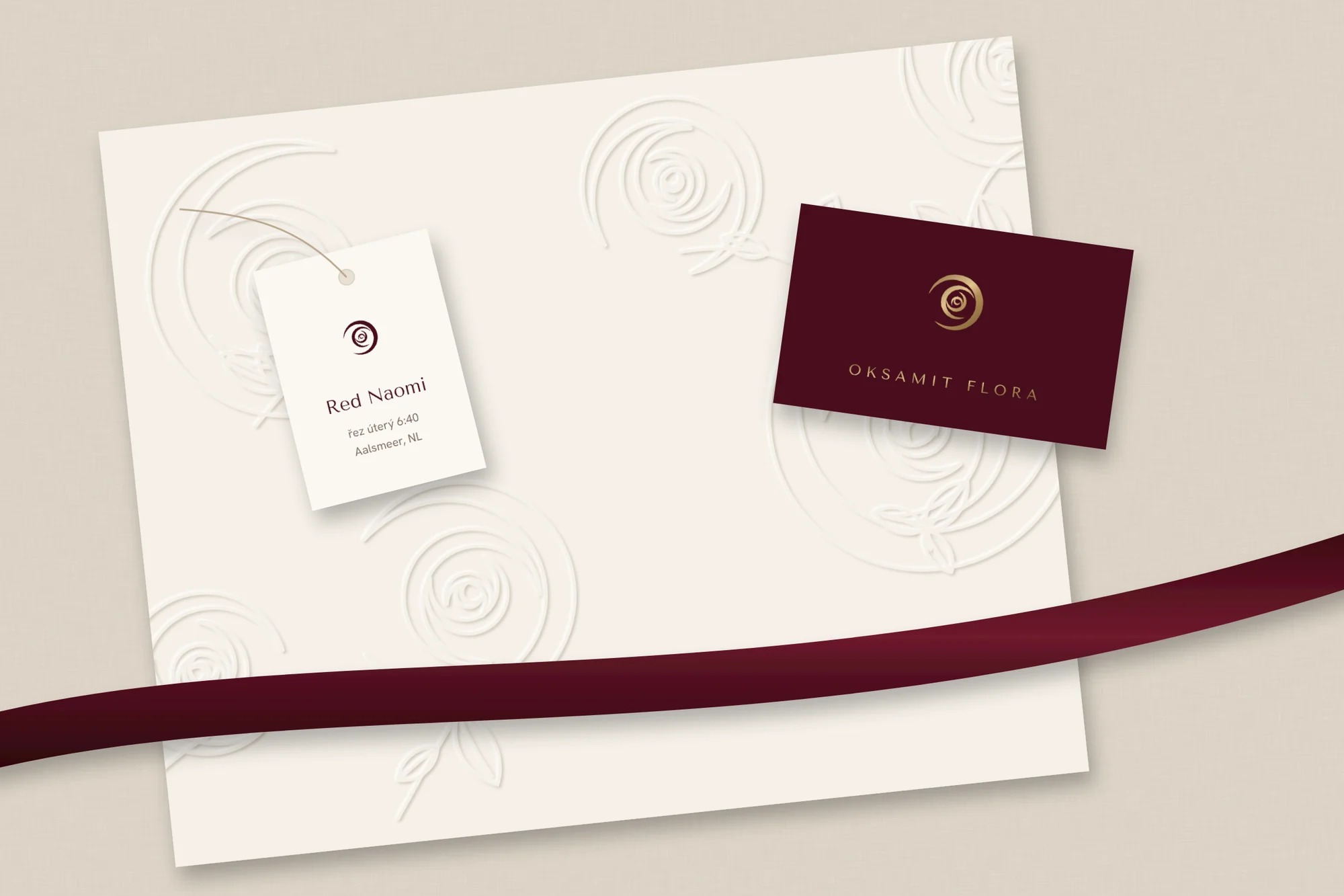
The same visual language runs through a velvet ribbon with a monogram, tags and business cards, thank-you cards, the courier’s car and uniform, Instagram templates and order emails.
What I learned
Luxury is what you leave out
An unfamiliar name is an opportunity
Explain the word with a story, and it becomes the strongest part of the brand.
The hardest decision
Removing the pink and the decoration.
Brand and UX are one
The idea of velvet runs from the logo through the photography to the speed of the animations.