Website redesign · Usťa s.r.o.
A boiler service, seen through a thermal camera
A redesign for a family boiler service around Brno. They install and repair gas boilers, and build boiler rooms for schools, courts and hotels. Their website hid almost all of that inside pop-up windows.


Context
Thirteen years of work, one logo and a button
Usťa is a family company. They service Baxi and De Dietrich boilers, and in 2025 they installed over 550 new ones. They also design and run larger boiler rooms with remote monitoring, for clients like the district court in Třebíč or the Brno public transport company.
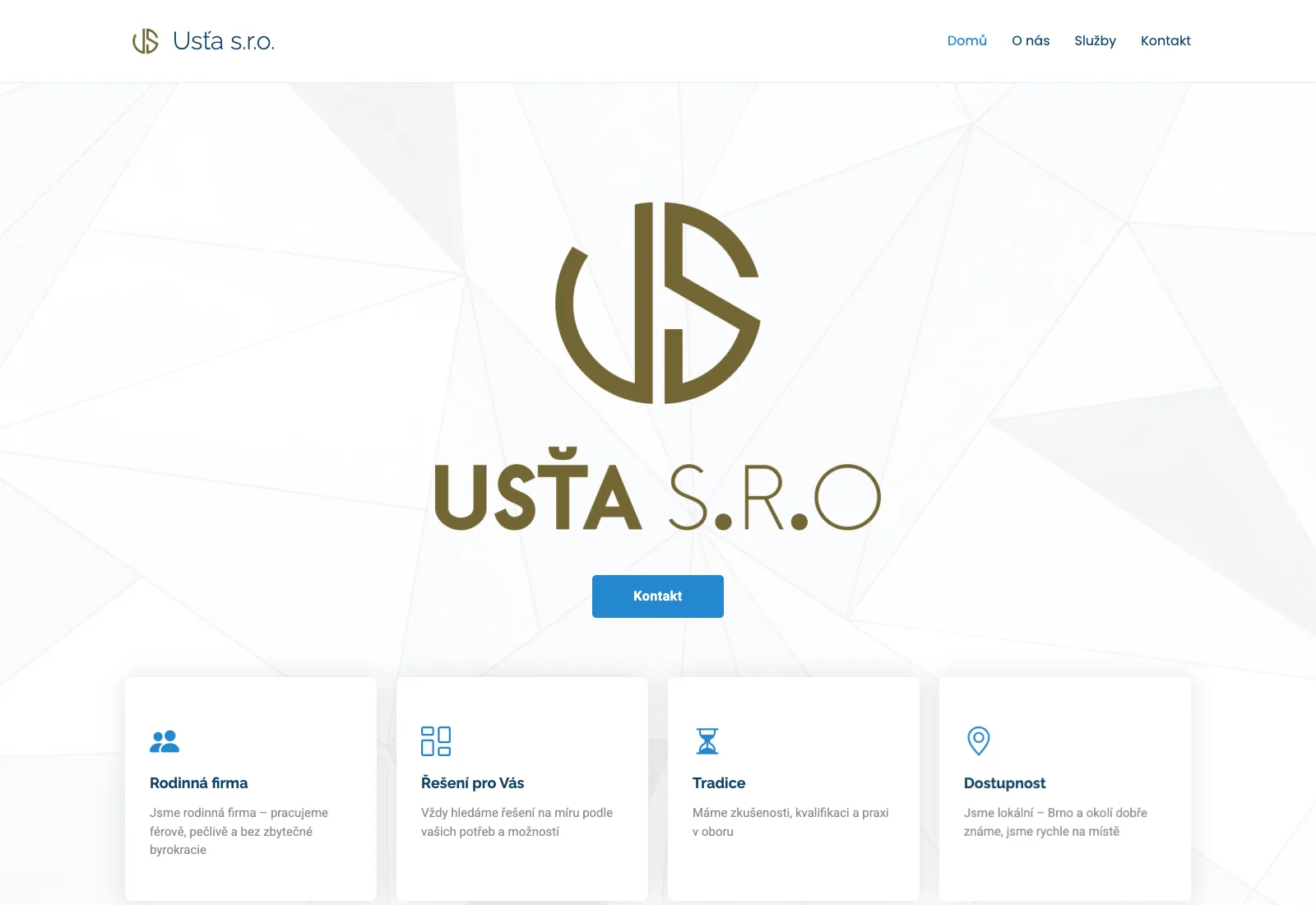
The homepage showed a large logo, a “Kontakt” button and four generic cards. On a phone, the whole first screen was the logo. Nothing said what the company does.
Audit
The best content was behind a click
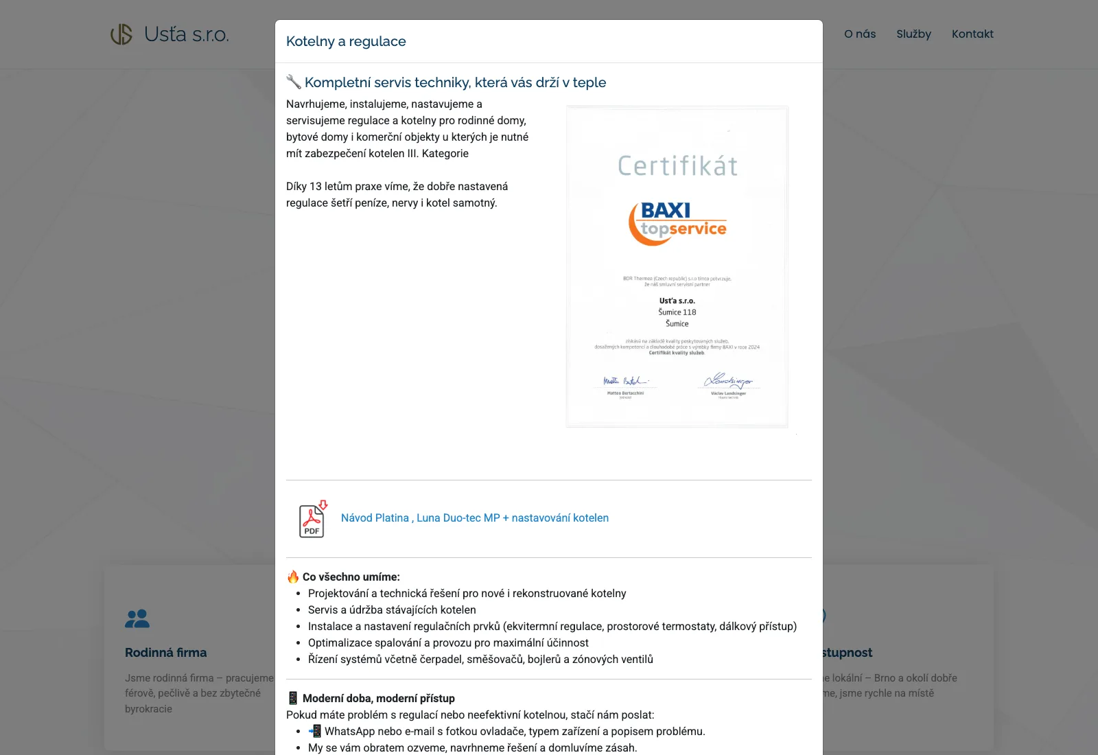
The site is one page with five pop-up windows. I opened every one. The strongest arguments were all there, written by the owner, but you had to find the right card and click to see them.
| What I found | What the redesign does |
|---|---|
| The most useful tip, “send us a photo of the display on WhatsApp”, sits deep inside two pop-ups. | It becomes a whole homepage section, with three steps and an example chat. |
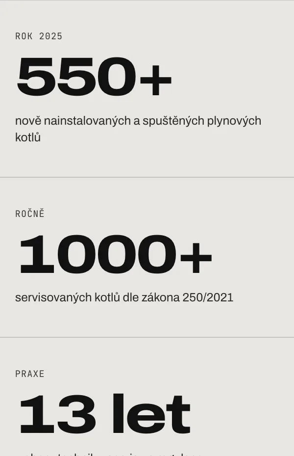
| The real numbers, 550+ new boilers and 1,000+ services a year, are emoji bullets in a pop-up. | A band of four numbers right under the hero. |
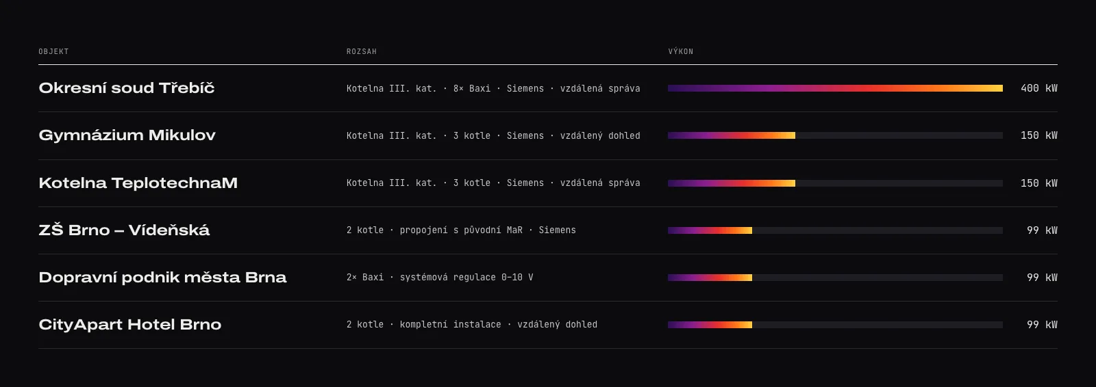
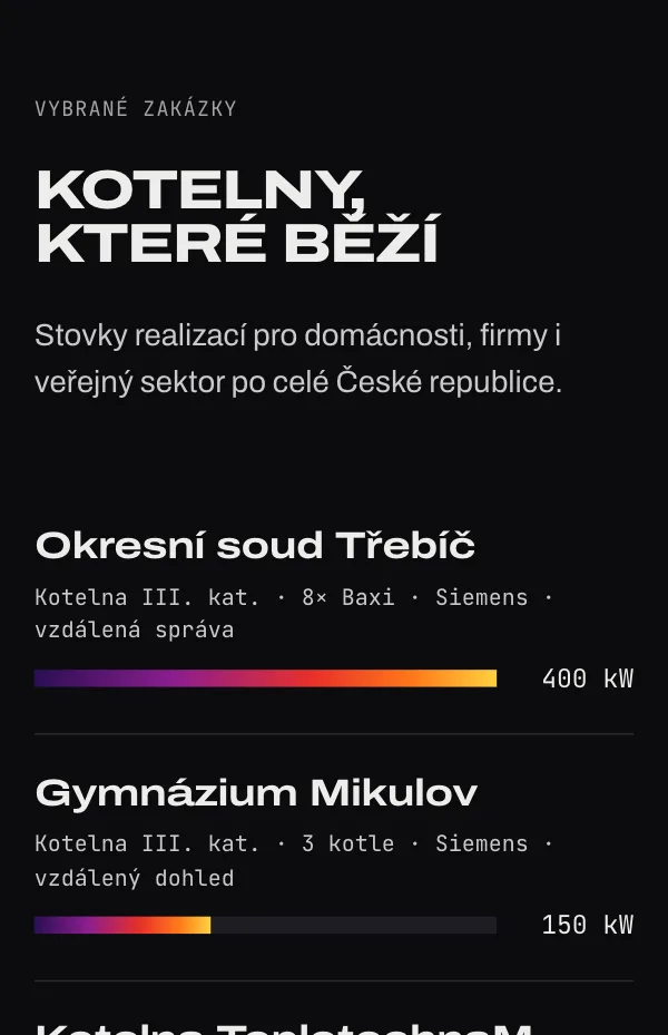
| Six reference projects, from a court to a hotel, are a plain list in another pop-up. | A reference table with the output of each boiler room drawn as a heat bar. |
| Households with a broken boiler and institutions planning a boiler room get the same entry point. | Two doors in the hero: “My boiler isn’t working” and “We need a boiler room”. |
| A cleaning-services pop-up left over from a template, no page description for Google, and phone numbers only in the last pop-up. | One clear subject. Every phone number is in view, and the call button stays in the menu. |
Insight
Two audiences, two very different moods
I didn’t run customer interviews. The owner’s own texts already describe both groups clearly, and they arrive with completely different questions.
| Who | What they need | What the website gives them |
|---|---|---|
| A household, cold radiators | Help today, without explaining a fault code on the phone. | An orange first button, emergency hours, and a WhatsApp message with a photo instead of a call. |
| A school, a court, a hotel | Proof that this firm can design, secure and run a category III boiler room. | Brands they work with (Siemens, Honeywell, ESBE), references with output in kW, the Baxi certificate and free daily monitoring. |
The owner had already invented the best feature: “send us a photo”. The design only had to put it first.
Art direction
What a heating engineer actually sees
Heating websites tend to look alike: blue, flames and smiling men in overalls. A thermal camera is the tool heating engineers really use to find a fault. Its picture is technical and warm at the same time, so I used it as the visual idea.
The hero shows a boiler in false colour, with a crosshair, a temperature reading and a scale bar. The same heat gradient comes back in the reference bars and in a thin strip above the footer.
The client wanted to keep his logo, so I didn’t replace it. I redrew the original US monogram and gave it the new colours: a dark U and an orange S. The name next to it is now set in the same wide typeface as the headings.
#E7E6E2#0B0B0E#111111#FF5A1FOrange is the only flat accent. It marks what’s urgent: the emergency button, WhatsApp and the call. The full thermal gradient is used only where something is about heat.
Teplo, které nemusíte řešit
Archivo Expanded, extra bold capitals. Wide, heavy letters that feel like engineering signage.
SP1 55,2 °C · BAXI
HAVÁRIE PO–PÁ 8:00–18:30
JetBrains Mono for labels and readouts, like the display of a measuring device.
Hero
A thermal viewfinder
Drawn entirely in code: the warm core breathes slowly and the reading changes by a few tenths of a degree.
Detail
Viewfinder corners
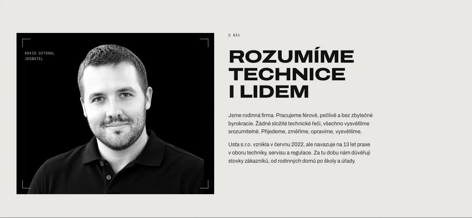
Thin brackets frame the hero, the reference photos and the owner’s portrait, as if each one was being measured.
What I left out
No flames, no emoji
The old texts used emoji as bullet points. Now a plus sign and clean lines do that job.
Before and after
Same company, a different first impression
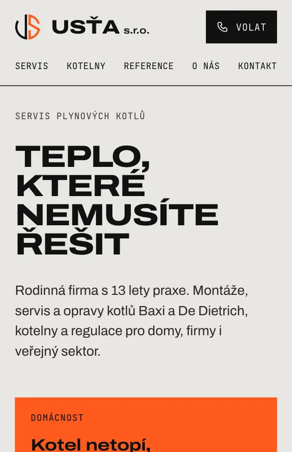
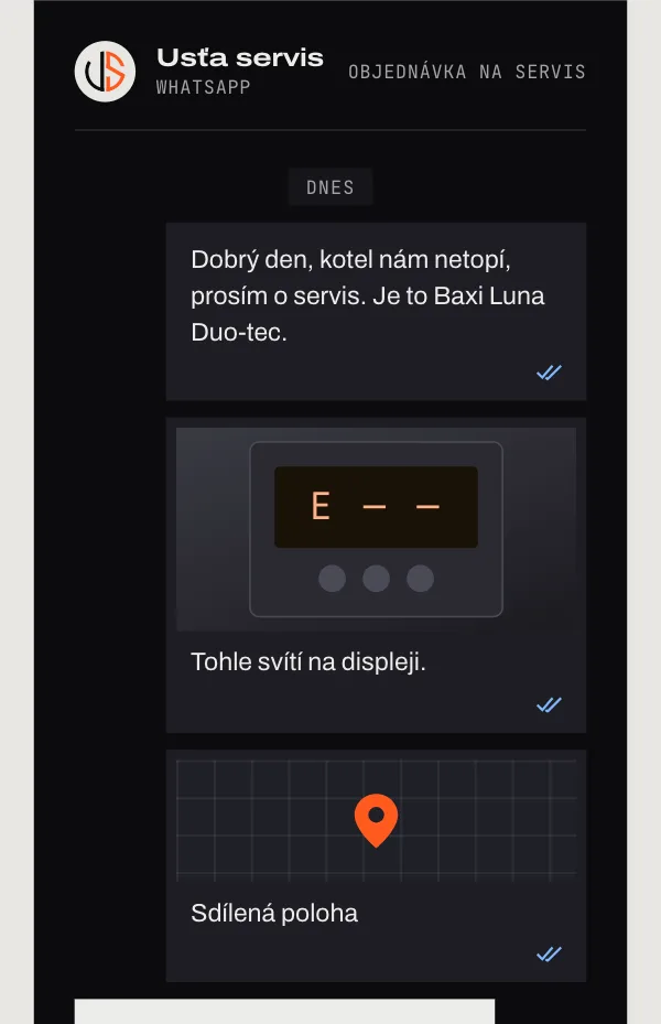
The same content, the same facts, the same screen size. Drag the line to compare the current website with the redesign.
 BeforeAfter

 BeforeAfter

 BeforeAfter
Signature section
Send a photo. We’ll do the rest.
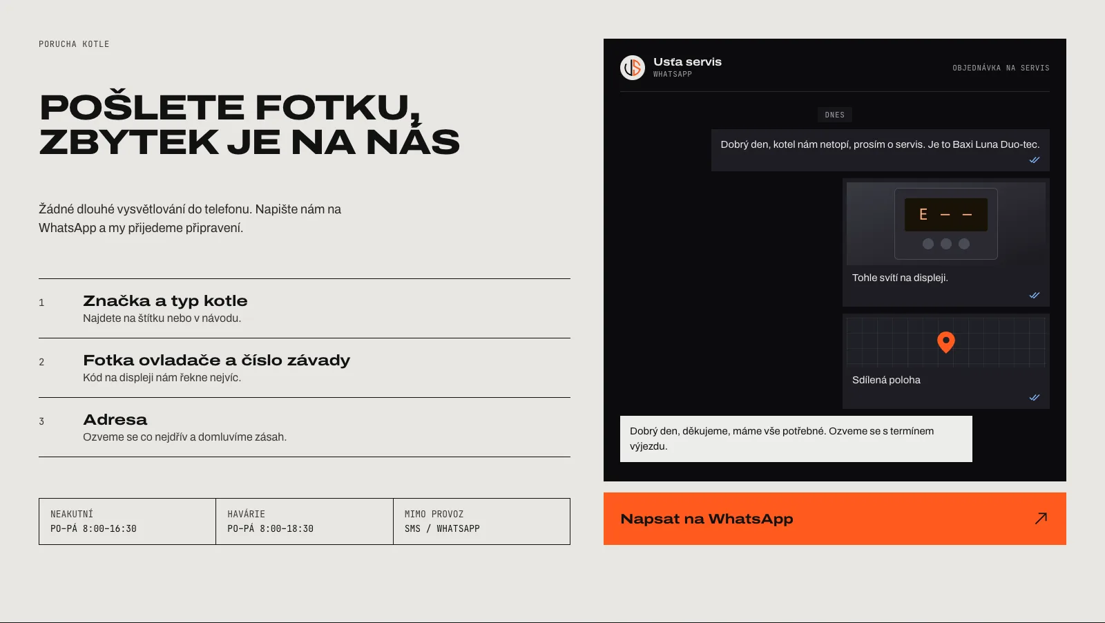
“Pošlete fotku, zbytek je na nás.” Three steps say what to send: the boiler brand and model, a photo of the display with the fault code, and the address. Next to them, an example chat shows what that looks like on WhatsApp. One orange button opens it.
Proof
Numbers and references, out of the pop-ups
Every number comes from the current website. Four of them sit right under the hero. The references become a table where each boiler room’s output is a heat bar. The 400 kW court boiler room fills the scale and the others are measured against it.

Structure
One page, from urgent to considered
The page goes from a broken boiler to a boiler-room project, the same way trust builds: help first, then proof, then the people behind it.
| Section | Its job |
|---|---|
| Hero | “Heat you don’t have to think about”, and two doors: households and institutions. |
| Numbers | Four facts in two seconds. |
| Boiler fault | What to send on WhatsApp, the opening hours and an example chat. |
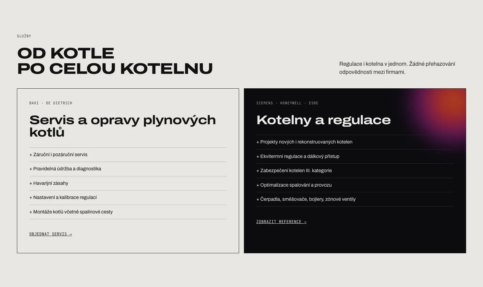
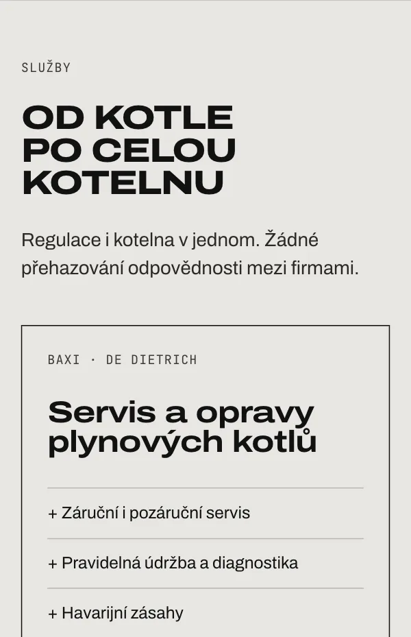
| Services | Boiler service in light, boiler rooms and controls in dark. |
| Documents | The Baxi topservice certificate and two manuals to download. |
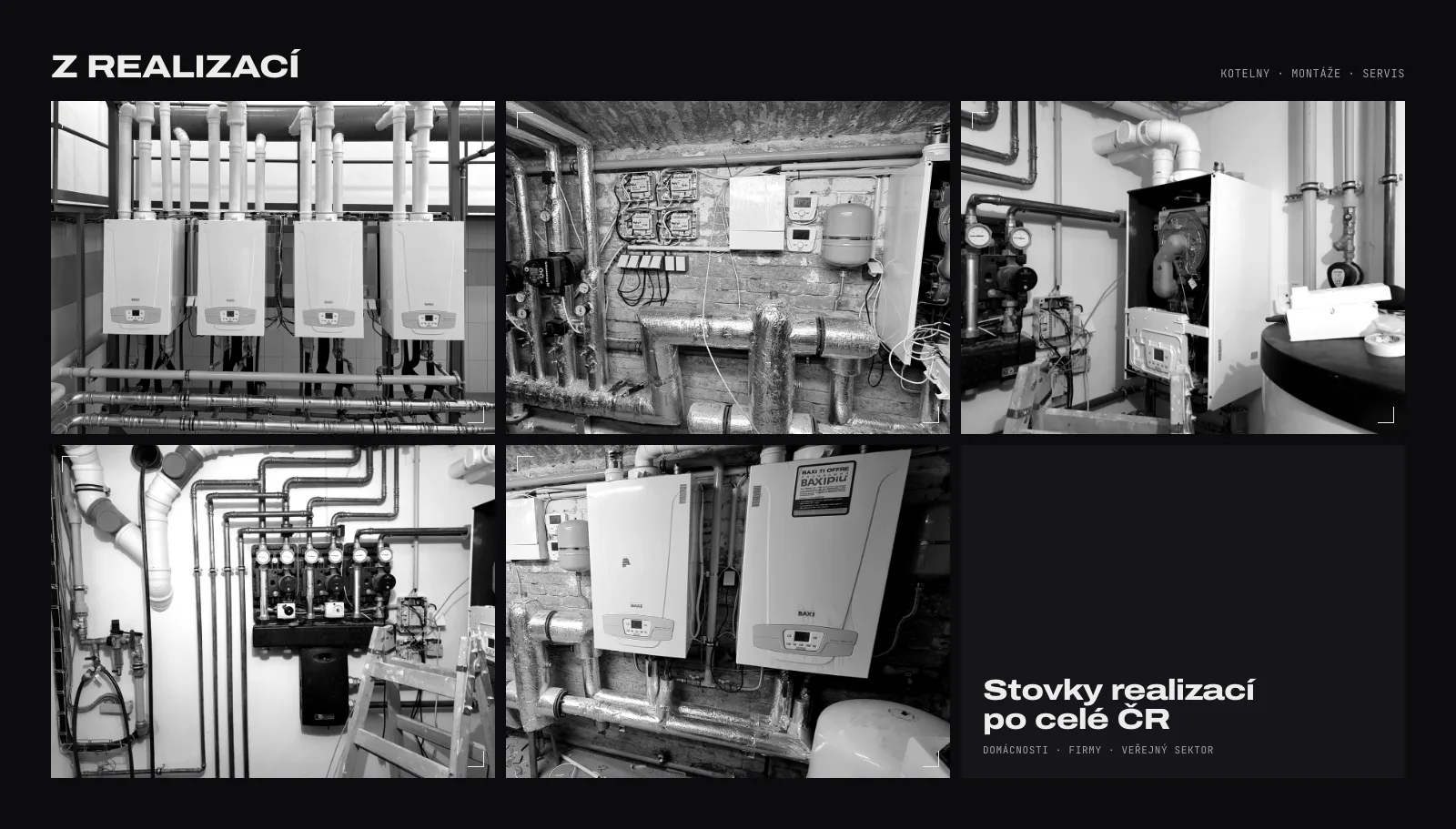
| References | Six projects with heat bars, photos and the free daily monitoring offer. |
| About | David Ustohal and two short paragraphs about the company, from the original text. |
| Contact | Two phone numbers with what each one is for, the address and e-mail. |
Mobile
Help within one thumb
Someone with a cold house is probably on a phone. The name and a short “Volat” (call) button share the top row, the menu fits on one line below them, and the orange “My boiler isn’t working” card comes right after the intro.

Content
Honest by default
Facts
Only what’s already published
Numbers, references, hours, phone numbers and services all come from the current website. Nothing was rounded up or added.
Copy
The owner’s own words
“We understand technology and people.” and “No shifting responsibility between firms” are from the old texts, just shorter and out of the pop-ups.
Photos
Real installations
All photos show the company’s own boiler rooms and its managing director, with no stock imagery.
Next
From proposal to a website that gets calls
This is a working prototype, not a launched site, so there are no results to report yet. These are the next steps:
Before launch
- Go through the proposal with the client and agree on the details.
- Move the PDF manuals and the certificate to the new site.
- Add a company ID, a privacy page and a page description for search.
To validate
- A short test on a phone: “report a broken boiler” and “find a boiler-room reference”.
- Count WhatsApp messages and calls from the website before and after launch.